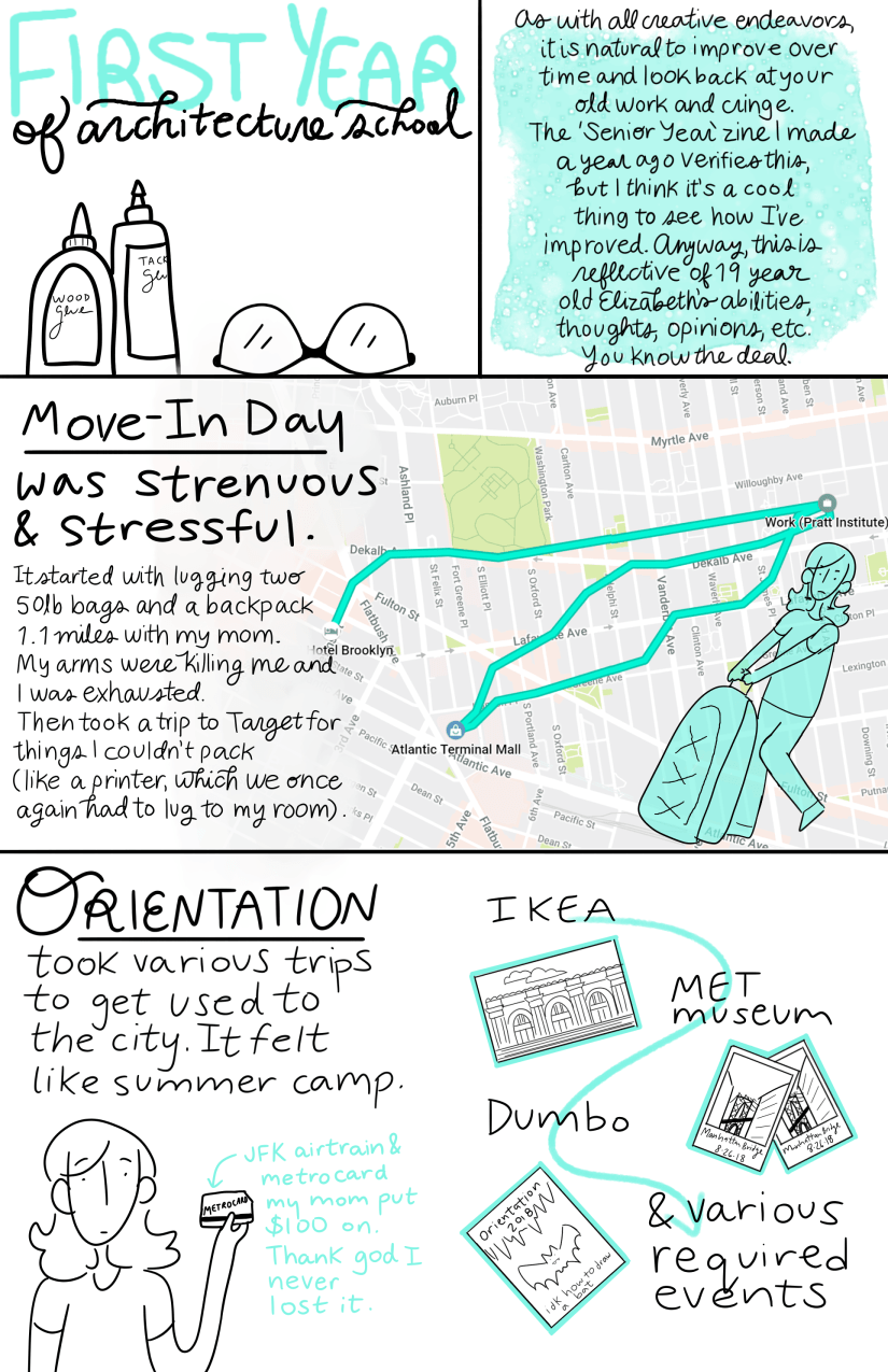
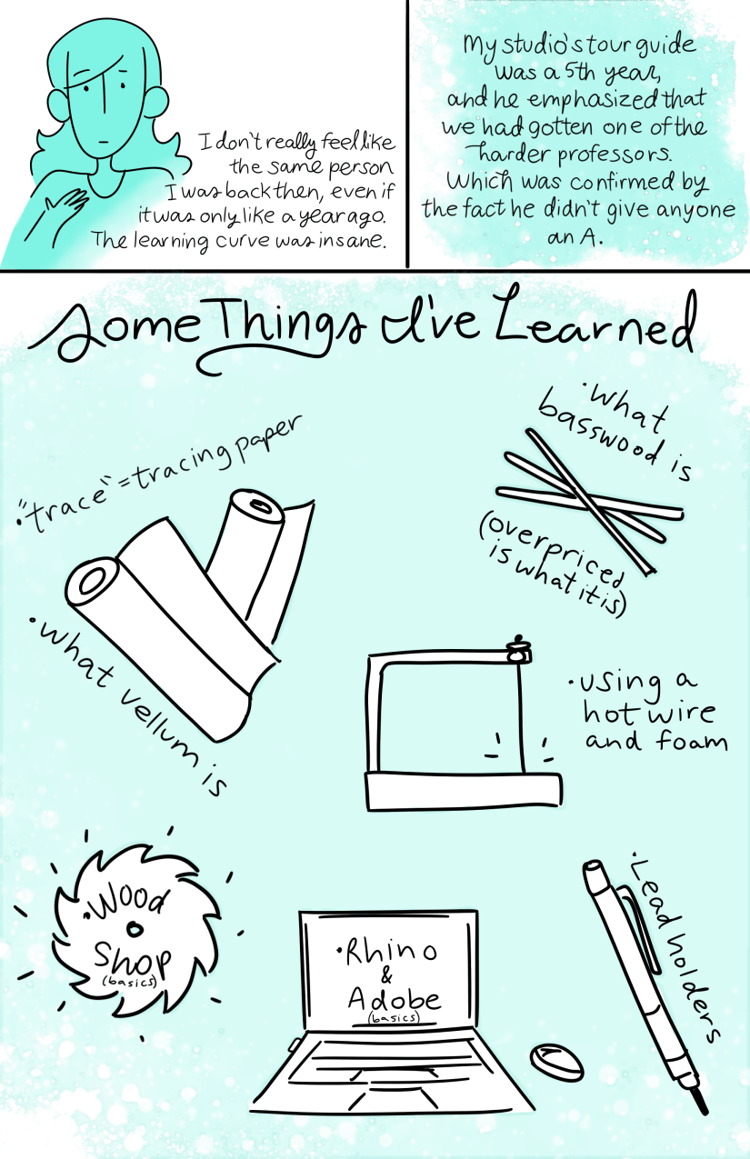
A lil zine to encapsulate my first year of architecture school. Obviously didn’t go full in detail about my assignments and that kind of thing but it’s kind of a general overview of my thoughts and feelings towards the campus, food, my dorm, the city, etc… I experienced so much! It’s hard to remember things that weren’t normal to me but grew to be normal.
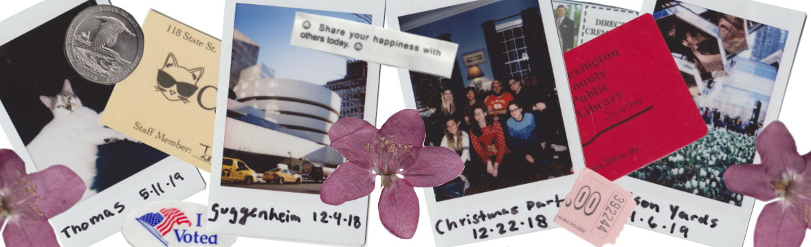
If you want to know what I did on a weekly basis, I did successfully post every Sunday night during the school year on my instagram (@elclapp) just to give a lil update. Still deciding on whether or not to do it again this year? It was a nice weekly personal reflection but I feel like I’m feeding into that toxic social media culture.
Here are some thoughts on the zine and my improvement from my 2018 ‘Senior Year’ zine:
- One major difference is that the Senior Year zine was drawn over the course of the last part of the school year and post-graduation, while this one was drawn completely in the summer. This might have helped it look more consistent (but even then I started drawing in May, took a break, and finished in July). Also, drew a draft of the Senior Year one on paper, then drew over it digitally, whereas this one I just jumped in digitally.
- I definitely like the limited color palette more than what I had going on last year with various bright colors, and I think that my art style is a bit more consistent with the simple cartoon and stick figure combo, though I’m still playing around with my art style as it comes to eyes and noses… I like drawing squiggly or triangle noses but for the sake of easiness I went with just a line. I like eyes with a pupil, but dot eyes are much easier to get looking the same (see my zine from last year for what I’m talking about… those eyes are all over the place). Don’t get me started on full bodies and hands… I don’t know what I’m doing (cough, one reason I wish arch students had foundation year)
- I’m still working on my lettering. Typing all the text would probably save me a lot of time but I like the more personable feel of lettering. For a few places I wrote on top of text just so the spacing, size, and angle were consistent. Other places I got impatient (like the middle pages) and just wrote, which makes it a bit more sloppy. Rereading I found a few inconsistencies with my uppercase ‘I’s. Hopefully it is all legible though.
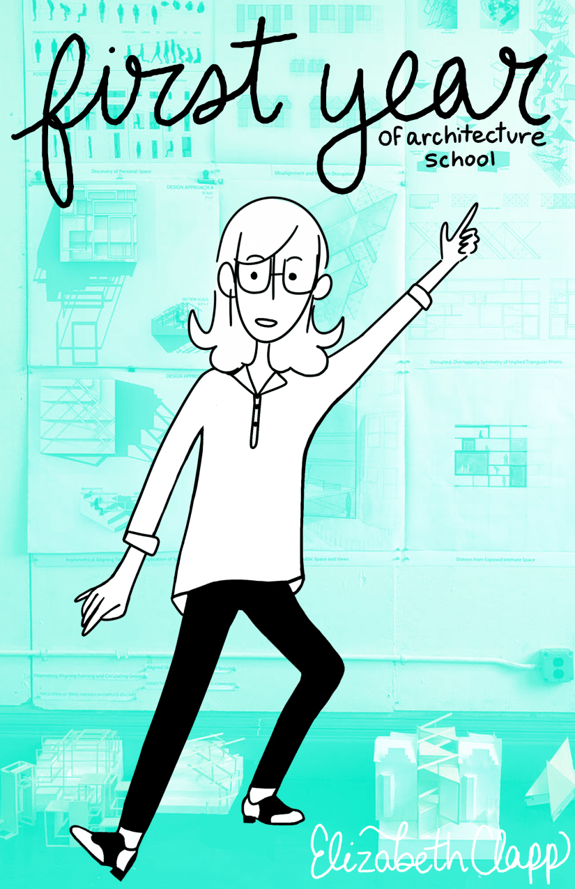
- The cover! I really like how this cover turned out. I’m slowly creeping out of my comfort zone of static poses. Also really like the contrast of the colored photo background and my drawing, reminds me of like a graphic novel or something?? Idk I just like it. I’m standing in front of my second semester design final in my typical presentation outfit.
I hope you have enjoyed this lil thing I made, and thanks for reading this far! Can’t believe I only have about a month left of summer….
Let me know what you think in the comments or on instagram : o

5 thoughts on “First Year of Architecture School: A Zine”